Why milk packets in India come in blue, green & orange colours. Most people never notice the real reason
Walk into any supermarket or local dairy shop in India and one thing instantly stands out in the milk section: the colourful milk packets. Blue, green, orange, yellow and sometimes even magenta packets line the shelves, making it easy for shoppers to pick their preferred milk without even reading the label properly.
For many Indian households, these colours have become second nature. People often ask for “the blue packet milk” or “the green packet one” instead of mentioning the actual milk type. But have you ever wondered why milk packets in India use different colours and what these colours actually mean?
 The answer lies in a clever colour-coding system used by dairy brands to identify the fat content and category of milk.
What do different milk packet colours mean in India?
Contrary to popular belief, the colours on milk packets are not random branding choices. Most dairy companies use specific colours to help consumers quickly identify the type of milk they are buying.
While Food Safety and Standards Authority of India regulates food safety and labelling requirements, the actual packet colours are usually decided by dairy brands such as Amul, Mother Dairy and Aavin.
In general, the colour system followed by many Indian dairy brands works like this:
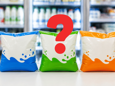
Blue milk packets usually represent toned milk, which contains around 3 per cent fat. Green packets are commonly used for standardised milk with roughly 4.5 per cent fat. Orange packets mostly indicate full cream milk, which has around 6 per cent fat and is considered richer and creamier. Some brands also use magenta packets for double-toned milk, which has lower fat content at approximately 1.5 per cent.
This simple colour coding helps consumers identify milk types instantly without needing to check nutrition labels every time.
Why dairy brands use colour-coded milk packets
Milk is one of the most frequently purchased items in Indian homes. Since most people buy milk almost daily, dairy brands need packaging that helps shoppers make quick decisions.
Colour coding works as a visual shortcut. Instead of reading technical details like fat percentages, people can simply remember a colour associated with their preferred milk type.
This becomes especially useful in crowded supermarkets or during busy morning shopping trips. Whether someone wants lighter milk for tea or richer milk for making sweets, the colour helps them pick the correct packet within seconds.
The system also reduces confusion when multiple variants from the same brand are placed next to each other on store shelves.
Does packet colour indicate milk quality?
One common misunderstanding among consumers is that darker or brighter milk packets mean better quality milk. In reality, packet colour has nothing to do with milk quality.
The colours only indicate the type of milk and its fat content.
For example, double-toned milk is lighter and lower in fat, while full cream milk is richer and thicker. Neither is universally “better” than the other. The right choice depends entirely on personal preference, dietary habits and household needs.
Some families prefer toned milk for everyday consumption, while others choose full cream milk because it works better for curd, sweets and cooking.
How milk packet colours became part of Indian daily life
Over the years, milk packet colours have quietly become part of Indian household language.
This familiarity has been passed down across generations. Children grow up watching parents buy specific coloured packets and eventually continue the same habits themselves.
That is why people often remember the packet colour more easily than the actual product name.
Interestingly, this kind of visual memory plays a huge role in consumer behaviour. Once shoppers associate a colour with taste, texture and routine, they tend to stay loyal to that choice for years.
Why the milk packet colour system works so well
The success of the milk packet colour system comes down to one thing, simplicity.
Good packaging design should make life easier for consumers, and that is exactly what these colours achieve. Without saying much, the packet instantly communicates useful information about fat content, milk style and intended use.
In fast-moving households where milk is bought almost automatically every morning, this convenience matters a lot.
The system also proves how even small design choices can shape everyday habits. What may look like a simple coloured packet is actually a smart communication tool used by dairy brands across India.
So the next time you pick up a blue, green or orange milk packet from the shop, you will know that the colour is doing far more than just making the shelf look attractive.
Inputs from TOI
For many Indian households, these colours have become second nature. People often ask for “the blue packet milk” or “the green packet one” instead of mentioning the actual milk type. But have you ever wondered why milk packets in India use different colours and what these colours actually mean?
What do different milk packet colours mean in India?
Contrary to popular belief, the colours on milk packets are not random branding choices. Most dairy companies use specific colours to help consumers quickly identify the type of milk they are buying.
While Food Safety and Standards Authority of India regulates food safety and labelling requirements, the actual packet colours are usually decided by dairy brands such as Amul, Mother Dairy and Aavin.
In general, the colour system followed by many Indian dairy brands works like this:
Blue milk packets usually represent toned milk, which contains around 3 per cent fat. Green packets are commonly used for standardised milk with roughly 4.5 per cent fat. Orange packets mostly indicate full cream milk, which has around 6 per cent fat and is considered richer and creamier. Some brands also use magenta packets for double-toned milk, which has lower fat content at approximately 1.5 per cent.
This simple colour coding helps consumers identify milk types instantly without needing to check nutrition labels every time.
Why dairy brands use colour-coded milk packets
Milk is one of the most frequently purchased items in Indian homes. Since most people buy milk almost daily, dairy brands need packaging that helps shoppers make quick decisions.
Colour coding works as a visual shortcut. Instead of reading technical details like fat percentages, people can simply remember a colour associated with their preferred milk type.
This becomes especially useful in crowded supermarkets or during busy morning shopping trips. Whether someone wants lighter milk for tea or richer milk for making sweets, the colour helps them pick the correct packet within seconds.
The system also reduces confusion when multiple variants from the same brand are placed next to each other on store shelves.
Does packet colour indicate milk quality?
One common misunderstanding among consumers is that darker or brighter milk packets mean better quality milk. In reality, packet colour has nothing to do with milk quality.
The colours only indicate the type of milk and its fat content.
For example, double-toned milk is lighter and lower in fat, while full cream milk is richer and thicker. Neither is universally “better” than the other. The right choice depends entirely on personal preference, dietary habits and household needs.
Some families prefer toned milk for everyday consumption, while others choose full cream milk because it works better for curd, sweets and cooking.
How milk packet colours became part of Indian daily life
Over the years, milk packet colours have quietly become part of Indian household language.
This familiarity has been passed down across generations. Children grow up watching parents buy specific coloured packets and eventually continue the same habits themselves.
That is why people often remember the packet colour more easily than the actual product name.
Interestingly, this kind of visual memory plays a huge role in consumer behaviour. Once shoppers associate a colour with taste, texture and routine, they tend to stay loyal to that choice for years.
Why the milk packet colour system works so well
The success of the milk packet colour system comes down to one thing, simplicity.
Good packaging design should make life easier for consumers, and that is exactly what these colours achieve. Without saying much, the packet instantly communicates useful information about fat content, milk style and intended use.
In fast-moving households where milk is bought almost automatically every morning, this convenience matters a lot.
The system also proves how even small design choices can shape everyday habits. What may look like a simple coloured packet is actually a smart communication tool used by dairy brands across India.
So the next time you pick up a blue, green or orange milk packet from the shop, you will know that the colour is doing far more than just making the shelf look attractive.
Inputs from TOI
Next Story