Don't Judge a Snack by Its Taste; Judge It by the Packaging Selling It to You

Think about the last time you went grocery shopping. Maybe you only needed milk and bread, but somehow a new packet of cookies, a fancy juice, and a protein bar found their way into your basket. It happens to almost everyone. We usually blame impulse shopping, but that's only part of the story.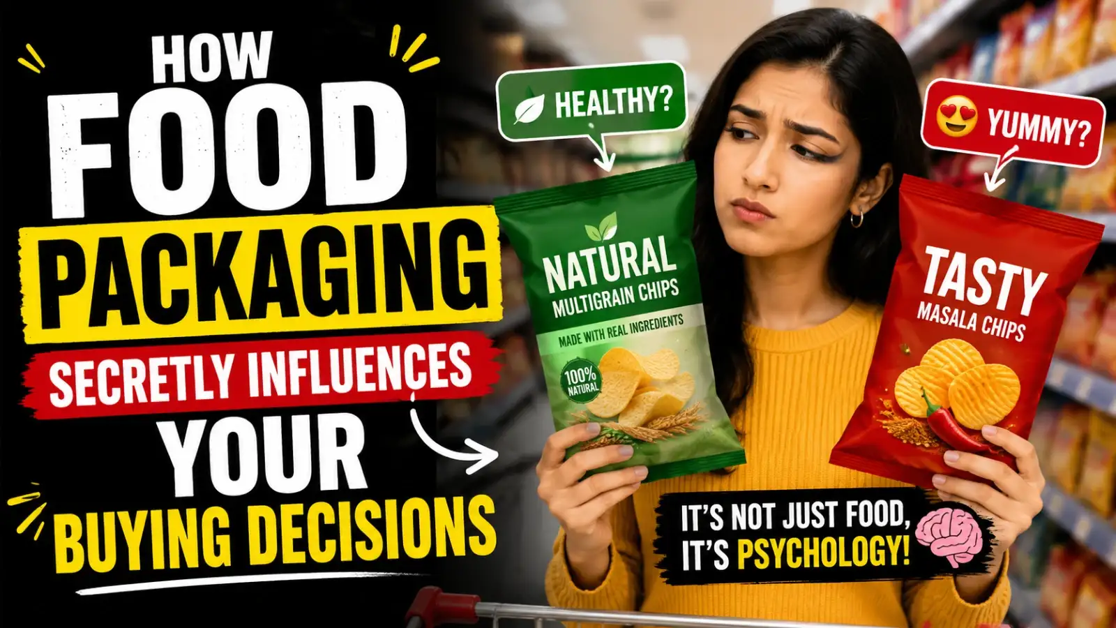
Companies spend months, sometimes even years, designing a single package. Every colour, every font, every image and every word is tested because brands know one thing: if they can make you pick up the product, they're already halfway to making a sale. Most of us don't notice it happening. We simply think we made a choice.
Now walk over to the organic section. Suddenly, everything turns green, beige, and earthy. The products instantly feel healthier, even before you've looked at the nutrition label.
Our brains make these associations automatically. Green feels fresh. Blue feels clean. Gold feels premium. We don’t come into the world thinking that way, but after seeing these colours used in the same context for years, our minds start to associate them with certain ideas.
A breakfast cereal can proudly advertise that it's high in fibre while quietly containing plenty of added sugar. A fruit drink can have bright pictures of mangoes all over the carton but contain very little actual fruit.
That's why nutrition labels are worth reading, even if the front of the package already seems convincing. The front is trying to sell you something. The back is where the facts usually live.
Packaging changes expectations. If something looks luxurious, we often assume it will taste better too. Restaurants, coffee brands, and chocolate companies have known this for years. Sometimes we're paying extra for the experience rather than a noticeably better product.
People naturally place more value on things that seem rare. Brands understand this, which is why you'll constantly see seasonal flavours, festival collections, and ‘only for a limited time’ labels. Nobody likes feeling as though they missed out.
Children may not have the money to buy products themselves, but they often influence the person pushing the shopping cart. Marketers know this better than anyone.
Before you've even opened the packet, you've already imagined how it's going to make you feel. That's powerful marketing.
You might still end up buying the same thing, and that's perfectly fine. At least then, the decision will be yours, not one quietly made by the packaging before you even reached for it.
Companies spend months, sometimes even years, designing a single package. Every colour, every font, every image and every word is tested because brands know one thing: if they can make you pick up the product, they're already halfway to making a sale. Most of us don't notice it happening. We simply think we made a choice.
The Colour Did the Talking
Walk into any supermarket and look at the snack aisle. You'll see bright reds, yellows, and oranges everywhere. That's not because designers happen to love those colours. They're loud, energetic and difficult to ignore. They naturally draw your eyes before anything else.Now walk over to the organic section. Suddenly, everything turns green, beige, and earthy. The products instantly feel healthier, even before you've looked at the nutrition label.
Our brains make these associations automatically. Green feels fresh. Blue feels clean. Gold feels premium. We don’t come into the world thinking that way, but after seeing these colours used in the same context for years, our minds start to associate them with certain ideas.
Those Healthy Words Can Be Misleading
Words like ‘natural,’ ‘multigrain,’ ‘real fruit,’ and ‘made with whole grains’ sound reassuring. The catch is that many of these terms don't tell you very much on their own.A breakfast cereal can proudly advertise that it's high in fibre while quietly containing plenty of added sugar. A fruit drink can have bright pictures of mangoes all over the carton but contain very little actual fruit.
That's why nutrition labels are worth reading, even if the front of the package already seems convincing. The front is trying to sell you something. The back is where the facts usually live.
Expensive Looking Means Better... Or Does It?
Here's something funny. Give the same chocolates to two people. Wrap one in shiny plastic and the other in a thick matte box with elegant lettering. Ask which one looks more premium. Most people will choose the second one without tasting either.You may also like
- How soon does your CIBIL score drop after missing an EMI? Understand bank rules
- Supreme Court Concerned Over Uninsured Vehicles; Why is 'No Insurance, No Fuel' Now Essential?
- UPI Won't Remain Completely Free; Someone Has to Bear the Cost: RBI Governor's Major Statement
- Frog Rain: Does it really rain frogs? Here's the science behind this strange event
- 518 Government Jobs in Jammu & Kashmir: Check Application Dates and Eligibility
Packaging changes expectations. If something looks luxurious, we often assume it will taste better too. Restaurants, coffee brands, and chocolate companies have known this for years. Sometimes we're paying extra for the experience rather than a noticeably better product.
Why Limited Edition Always Feels Special
We've all fallen for it at least once. A drink you've seen all year suddenly appears with festive packaging or a celebrity collaboration, and suddenly it feels worth trying. Nothing about the recipe may have changed. What changed was the feeling that it wouldn't be around forever.People naturally place more value on things that seem rare. Brands understand this, which is why you'll constantly see seasonal flavours, festival collections, and ‘only for a limited time’ labels. Nobody likes feeling as though they missed out.
Children Notice Packaging Faster Than Adults
Ever watched a child walk through a supermarket? They're not reading labels. They're spotting cartoon characters, bright colours, and fun-shaped boxes from the other end of the aisle. That's exactly what those packages are designed to do.Children may not have the money to buy products themselves, but they often influence the person pushing the shopping cart. Marketers know this better than anyone.
It's Not Really About Food
The smartest food brands don't just sell snacks. They sell comfort, they sell nostalgia, and they sell convenience. A biscuit packet that reminds you of childhood. A coffee brand that promises slow mornings. A chocolate wrapped like a luxury gift.Before you've even opened the packet, you've already imagined how it's going to make you feel. That's powerful marketing.
The Smarter Way to Shop
The next time you're standing in front of a supermarket shelf, take an extra ten seconds before picking something up. Flip the packet over. Read the ingredients instead of just the claims on the front. Compare it with the product next to it.You might still end up buying the same thing, and that's perfectly fine. At least then, the decision will be yours, not one quietly made by the packaging before you even reached for it.






Loving Newspoint? Download the app now