The Psychology of Product Colours: How Brands Use Colour to Influence What You Buy

Let's play a quick game. Close your eyes for a second and picture a Coca-Cola can. You probably saw bright red. Now think of Cadbury; it is purple. How about WhatsApp? That's green. Funny thing is, you didn't have to think very hard. Those colours have become so closely linked with the brands that your brain recognised them instantly.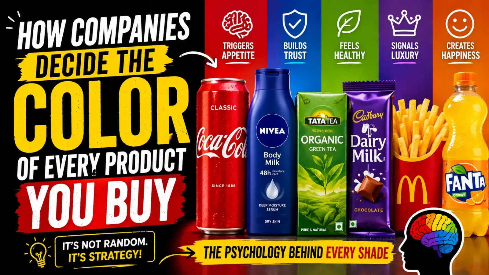
But here's the real question. Why those colours? Why isn't Coca-Cola blue? Why isn't Spotify orange? And why do so many health products come in shades of green while luxury brands seem obsessed with black and gold? The answer has very little to do with what looks pretty. It has everything to do with how our brains react to colour.
Only after that do you look at the ingredients or the price. That's why companies spend so much time choosing the "right" colour. Because if they can't catch your attention, they may never get the chance to convince you to buy.
Red naturally grabs our attention and creates a sense of excitement and energy. Yellow is a happy and visible colour from far away, so you will often find it combined with yellow. Together they make a powerful mix that helps brands stand out in an over-crowded marketplace.
When companies want customers to feel safe handing over their money or personal information, blue quietly reinforces that feeling. Of course, colour alone doesn't create trust. But it certainly helps shape first impressions.
Sometimes that's because the product genuinely is environmentally friendly. Sometimes it's simply clever branding. Either way, companies know our brains already connect green with health and freshness.
These colours create a feeling of elegance and exclusivity. Luxury brands don't usually try to shout the loudest. They try to whisper with confidence.
Companies will often try out several versions of the same colour before launching a product, because tiny changes can affect the way people see it. Sometimes a slightly darker shade is all it takes to make something feel more premium.
A design that works perfectly in one market may send a completely different message somewhere else. It's a reminder that colour isn't just about psychology. It's also about culture.
It can make something feel more trustworthy, more premium and more fun, or healthier. And when dozens of similar products are sitting side by side on the same shelf, that first impression matters.
Chances are, none of it happened by accident. Someone researched it. Someone tested it. Someone carefully chose that exact shade because they believed it would catch your eye before anything else. And the funny thing is, it probably did.
But here's the real question. Why those colours? Why isn't Coca-Cola blue? Why isn't Spotify orange? And why do so many health products come in shades of green while luxury brands seem obsessed with black and gold? The answer has very little to do with what looks pretty. It has everything to do with how our brains react to colour.
Your brain makes up its mind faster than you think
Imagine you're standing in a supermarket. There are hundreds of packets of biscuits. Dozens of shampoos. An entire aisle filled with breakfast cereals. You're definitely not reading every label. In reality, your brain starts making tiny decisions within seconds. It notices colours first. Then shapes. Then the logo.Only after that do you look at the ingredients or the price. That's why companies spend so much time choosing the "right" colour. Because if they can't catch your attention, they may never get the chance to convince you to buy.
Why Fast Food Loves Red
Have you ever noticed how many fast-food restaurants use red? It's hard to ignore. Red jumps out at you whether you’re walking down a busy street or scrolling through a food delivery app. That's exactly why brands love it.Red naturally grabs our attention and creates a sense of excitement and energy. Yellow is a happy and visible colour from far away, so you will often find it combined with yellow. Together they make a powerful mix that helps brands stand out in an over-crowded marketplace.
Why Banks and Tech Companies Love Blue
Now think about your banking app or your favourite airline, or even some of the biggest tech companies in the world. Chances are, blue appears somewhere. Blue is often associated with trust, reliability, and stability.When companies want customers to feel safe handing over their money or personal information, blue quietly reinforces that feeling. Of course, colour alone doesn't create trust. But it certainly helps shape first impressions.
Green Has Become the Colour of "Healthy"
Walk through the organic section of any supermarket. You'll notice a pattern almost immediately. Green packaging is everywhere. It reminds us of nature, fresh ingredients, and sustainability.Sometimes that's because the product genuinely is environmentally friendly. Sometimes it's simply clever branding. Either way, companies know our brains already connect green with health and freshness.
Luxury Brands Rarely Need Bright Colours
Luxury works differently. There are expensive perfumes, designer handbags, and premium watches. Notice how many of them come in black, white, gold, or silver packaging.These colours create a feeling of elegance and exclusivity. Luxury brands don't usually try to shout the loudest. They try to whisper with confidence.
It's Not Just About the Colour
Here's something most people don't realise. Choosing "blue" isn't enough. There are hundreds of different blues. A bright sky blue feels playful, while a deep navy feels professional and a soft pastel blue feels calm.Companies will often try out several versions of the same colour before launching a product, because tiny changes can affect the way people see it. Sometimes a slightly darker shade is all it takes to make something feel more premium.
You may also like
- Major Change in US Visa Rules: Application Will Be Rejected If Even One Document Is Missing
- EPFO: A major gift in August—access stuck funds in a jiffy via the e-Praapti Portal
- Solar Eclipse : When will this year's second solar eclipse occur, August 11 or 12? Will the Sutak period be observed in India?
- Can a D&C Cause a Thin Endometrium? Signs, Recovery and Pregnancy Chances
- Simple ways prevent waterborne diseases in monsoons
Colours Mean Different Things Around the World
Colour isn't universal. In one country, a colour might represent celebration. In another, it could symbolise mourning. That's why global brands usually make little changes to their packaging depending on where they are selling their products.A design that works perfectly in one market may send a completely different message somewhere else. It's a reminder that colour isn't just about psychology. It's also about culture.
So... Are We Being Manipulated?
Not exactly. A colourful packet can't make a bad product good. If something tastes awful or breaks after a week, no amount of clever design can fix that. But colour can influence which product you notice first.It can make something feel more trustworthy, more premium and more fun, or healthier. And when dozens of similar products are sitting side by side on the same shelf, that first impression matters.
Final Thoughts
The next time you're shopping, take a moment to look beyond the product itself. Look at its colours. Ask yourself why a chocolate wrapper is purple, why a toothpaste tube is blue, or why an eco-friendly brand almost always chooses green.Chances are, none of it happened by accident. Someone researched it. Someone tested it. Someone carefully chose that exact shade because they believed it would catch your eye before anything else. And the funny thing is, it probably did.






Loving Newspoint? Download the app now